Web designers have a tricky job to do: balancing the needs and wants of clients with the needs and wants of users, which may not align. The pressure to include trendy design elements or fancy bells and whistles can only make this balancing act more difficult.
A website design cannot be successful, however, if it does not adequately serve users. Some web page effects and behaviors may be visually cool but will negatively impact user experience and site effectiveness.
Here are some irritating design trends that website owners would do best to avoid. Knowing why these trends are bad for users will help you understand how to find better solutions.
1. Overdone animation
The ability to create lightweight animations using only css has created an explosion of motion graphics across the web. These animations use less processing power than javascript-based effects and can be incorporated into pages without significantly slowing load times.
Purposeful website animations and micro-interactions can help keep users engaged and draw attention to important parts of a page. However, the ability to animate almost anything has led some website owners to overdo it.
Why it should go
The human brain is hardwired to react to unexpected movement. Before we sat comfortably on couches scanning tablets and phones, a sudden motion could indicate a mortal threat. And while an ad or other motion graphic may not be a matter of life and death, our eyes are still trained to react, jumping from point to point on the page.
This reaction, known as a saccade, is uncontrollable. It can cause web pages with too much motion to be overwhelming because the eyes don't know where to go. Additionally, no matter how lightweight each individual animation may be, too many effects can collectively become heavy and slow loading times.
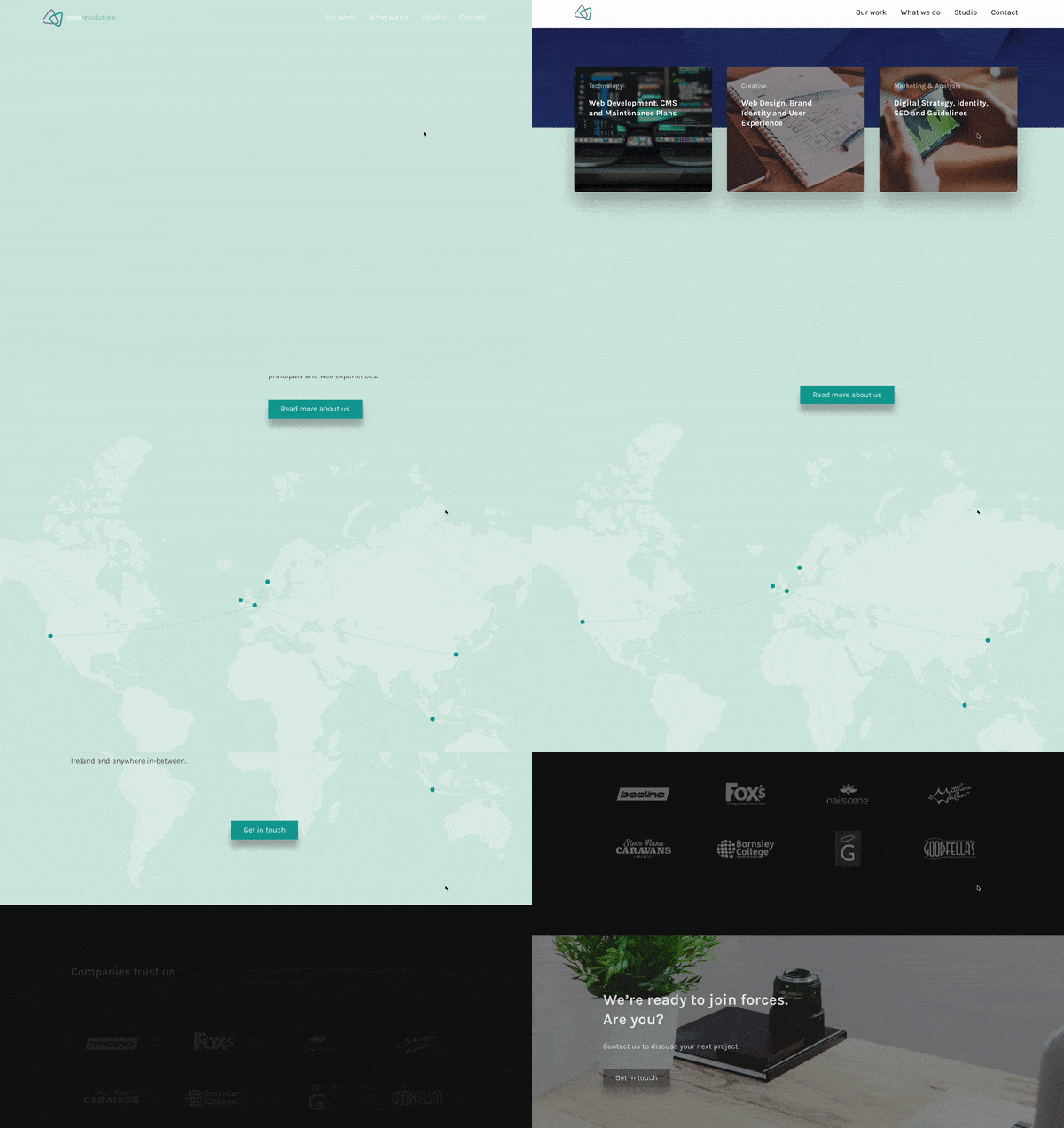
In the example below, it takes a full 10 seconds to scroll through the entire page — not because the page is loaded with content but because the user has to wait for the text animations to appear. There is no tangible advantage in this case to having text fade in as the user scrolls. This effect simply says, “Hey, look what we can do.” And the only purpose it serves in this instance is making the visitor wait, which can lead to frustration.
Do it right
When done correctly, animation can accomplish a number of things, including:
Providing feedback: People love affirmation, crave recognition and want instant gratification. Simple button animations, transitions, and process status updates tell users they have accomplished a task and help keep them engaged.
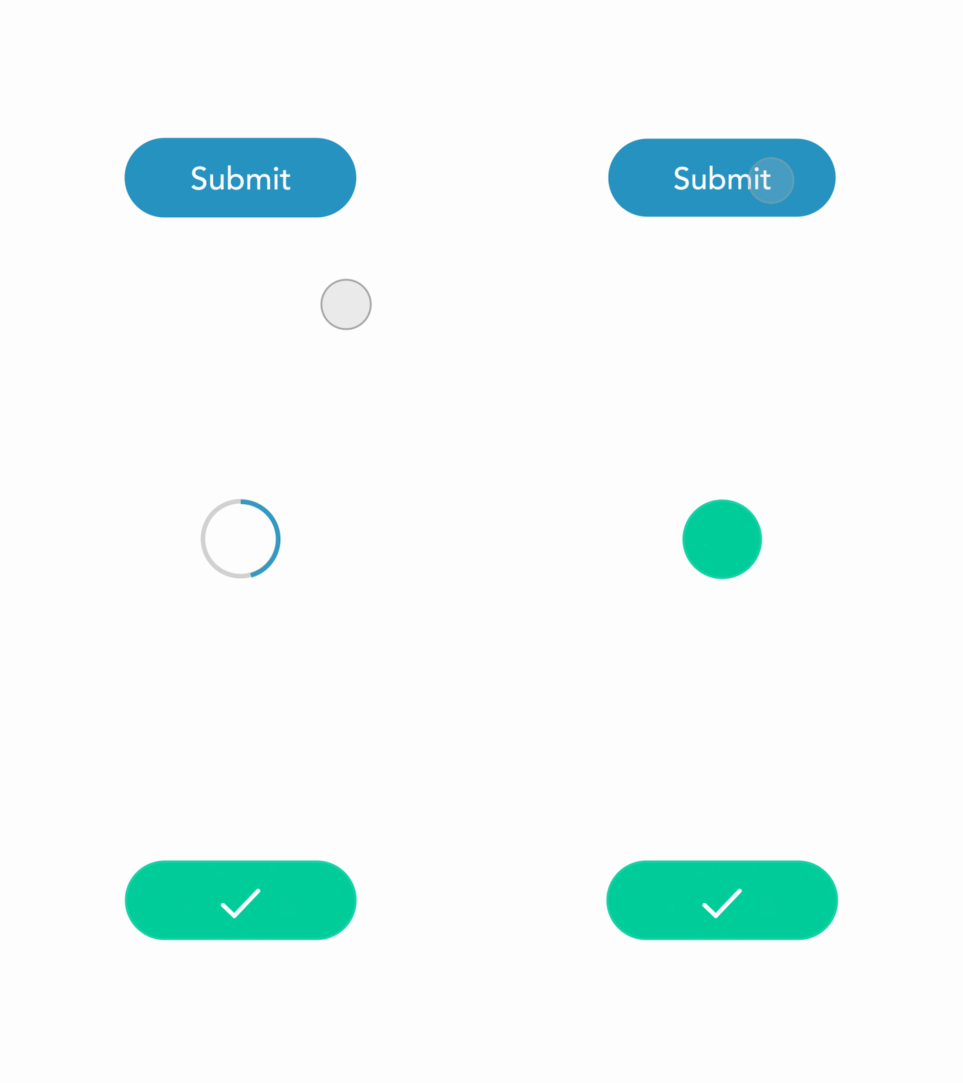
Submit Button Microinteraction, by Sailesh Gunasekaran
Giving tips or draw attention to important points: Small movements can point visitors to interactive features or calls to action.
Delighting users: Yes, animation can just be fun.
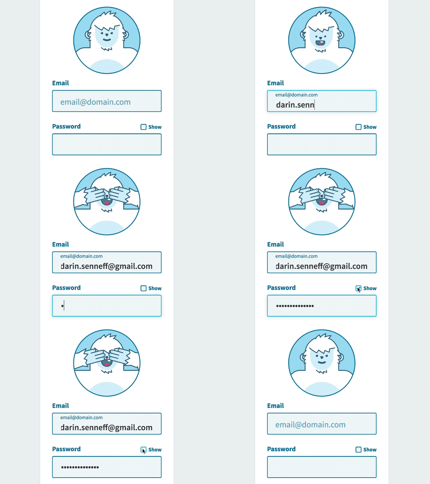
Yeti Login, by Darin
2. Scrolljacking
Scrolljacking is the practice of changing the basic rules for scroll bar behavior. Users come to expect certain physics from a scroll, based on their browser and operating system. Scrolljacking changes the physics and causes the scroll to behave in unpredictable ways.
In a common scrolljacking example, a page will control where the user stops and starts, regardless of the speed at which they are attempting to scroll. A visitor cannot simply more through the page as expected.
Why it should it go
Scrolljacking changes the fundamental way visitors interact with websites and breaks trust with users. It removes the control people are used to having over their online experience. Most people don't think about the scroll, and hijacking it forces them to focus on something other than page content.
Scrolljacking challenges several established human psychological phenomenon:
The mere-exposure effect: The mere-exposure effect says that people prefer things that are familiar. Generally, people see familiar things as safe and unfamiliar things as potentially unsafe.
Outcome primacy: Outcome primacy says that people assume all subsequent interactions with a thing will be the same as the first interaction. The internet has been around long enough that users have well-established assumptions about the way pages behave. When those assumptions are challenged, users may become confused or dissatisfied.
Hot-potato behavior: People scan web pages, looking for relevant bits of information, and they have become used to scrolling while scanning. The hot-potato scanning pattern happens when people hop from place to place to try to avoid fixating on an element they may not be interested in. Hijacking the scroll prevents people from scanning in this familiar way.
Do it right
There are different levels of scrolljacking, some of which have become familiar to users and could be incorporated successfully into a website. If the purpose of your website is to prompt people to explore, and to awaken an innate desire to discover new things, a little scrolljacking might be helpful.
The most common example of scrolljacking is parallax scrolling, where objects in the background and foreground of the page to move at different speeds, creating a floating effect. Parallax scrolling has become popular enough that most people are comfortable with this small level of scrolljacking.
3. Automatically playing anything
Autoplaying page elements has made a comeback, particularly in the form of video ads. Advertisers love autoplay ads, because they get a lot of views and therefore produce significant revenue. But video ads are not the only culprits: sound, carousels and native video content also disrupt the user experience by autoplaying.
Why it should go
When elements play automatically, you are again taking control away from the user. Carousels that autoplay prevent the reader from clicking through information at a comfortable speed. Autoplaying sound forces people to stop looking at the content of your website and start searching for the stop button — not to mention the potential embarrassment of sudden sound at inappropriate times. Autoplaying also takes up the user's bandwidth without permission, particularly in the case of video.
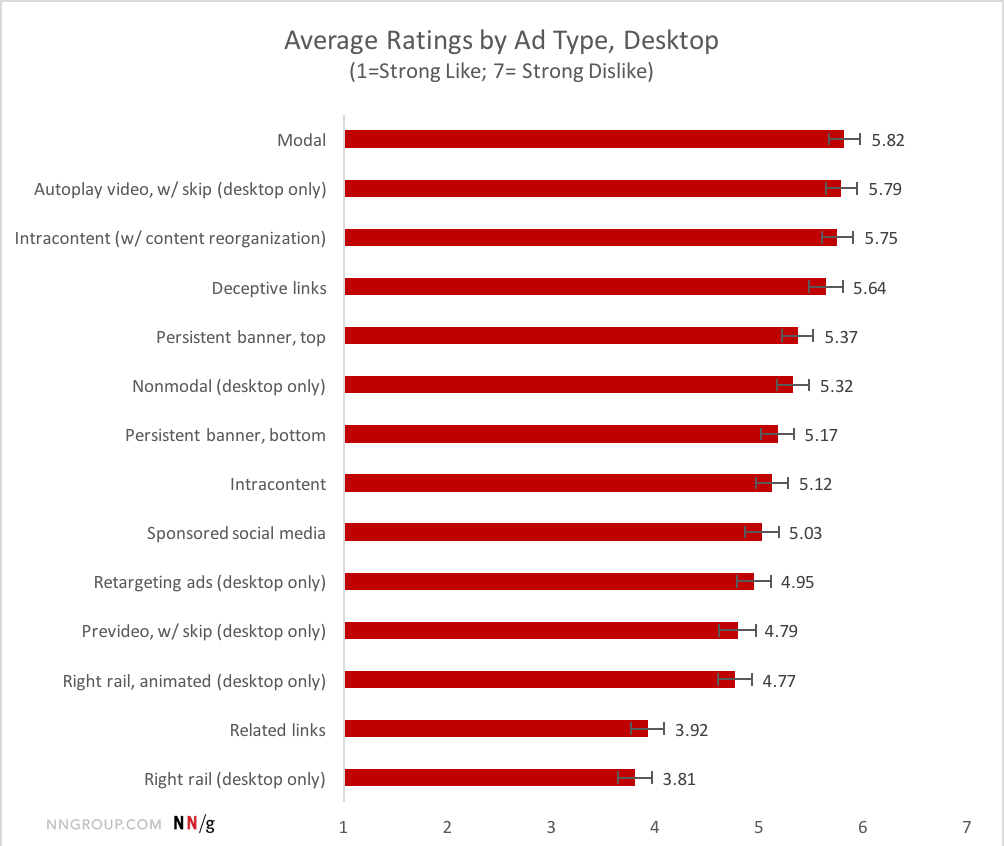
Research from the Nielsen Norman Group confirms that autoplay video ads are the second-most hated ad among their sample of internet users. Users also hate intracontent ads, which push content down as the ad expands.
Any media that autoplays, with sound or not, forces people's attention away from the task at hand. Most people visit a website for a specific reason — to find information or make a purchase, for example. If the quest to accomplish that task is too often interrupted, the site may be abandoned.
Doing it right:
One way autoplay video may be incorporated into a site effectively is in a landing page hero banner with silent background video. Putting a lightweight video into a banner and giving people the option to play a full-length video is less intrusive than other autoplay options.
If you are using carousels or slideshows on your pages, leave them static by default and give the user control over how quickly to view the content.
Most research on the evils of carousels is from between 2011 and 2013, and it is fair to say this research could use some updating. A more recent study that looked at carousels on mobile devices found more promising usage statistics. People are used to swiping on a phone, and a carousel could be a good compromise between space and usability.
4. The hamburger icon
The hamburger icon is the stacked, three-line menu graphic that is the default indicator of navigation on most mobile websites. And for the sake of this discussion, hamburgers on mobile devices are ok.
Desktop screens, however, have a lot of space that phones do not, and desktop navigation should not be treated like smartphone navigation. Hamburger icons are not only unnecessary on desktop layouts, they can also diminish navigation effectiveness.
Why it should go
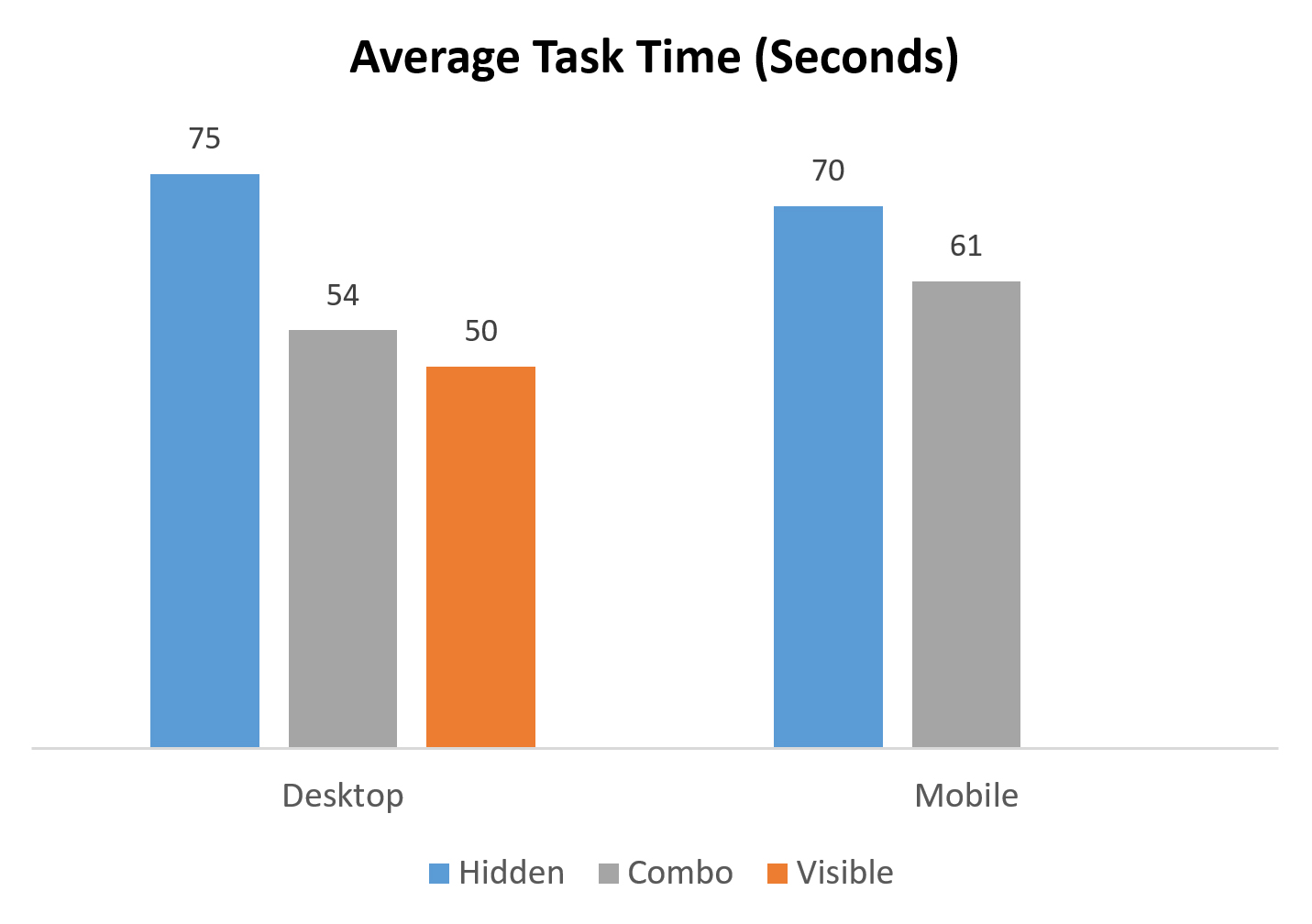
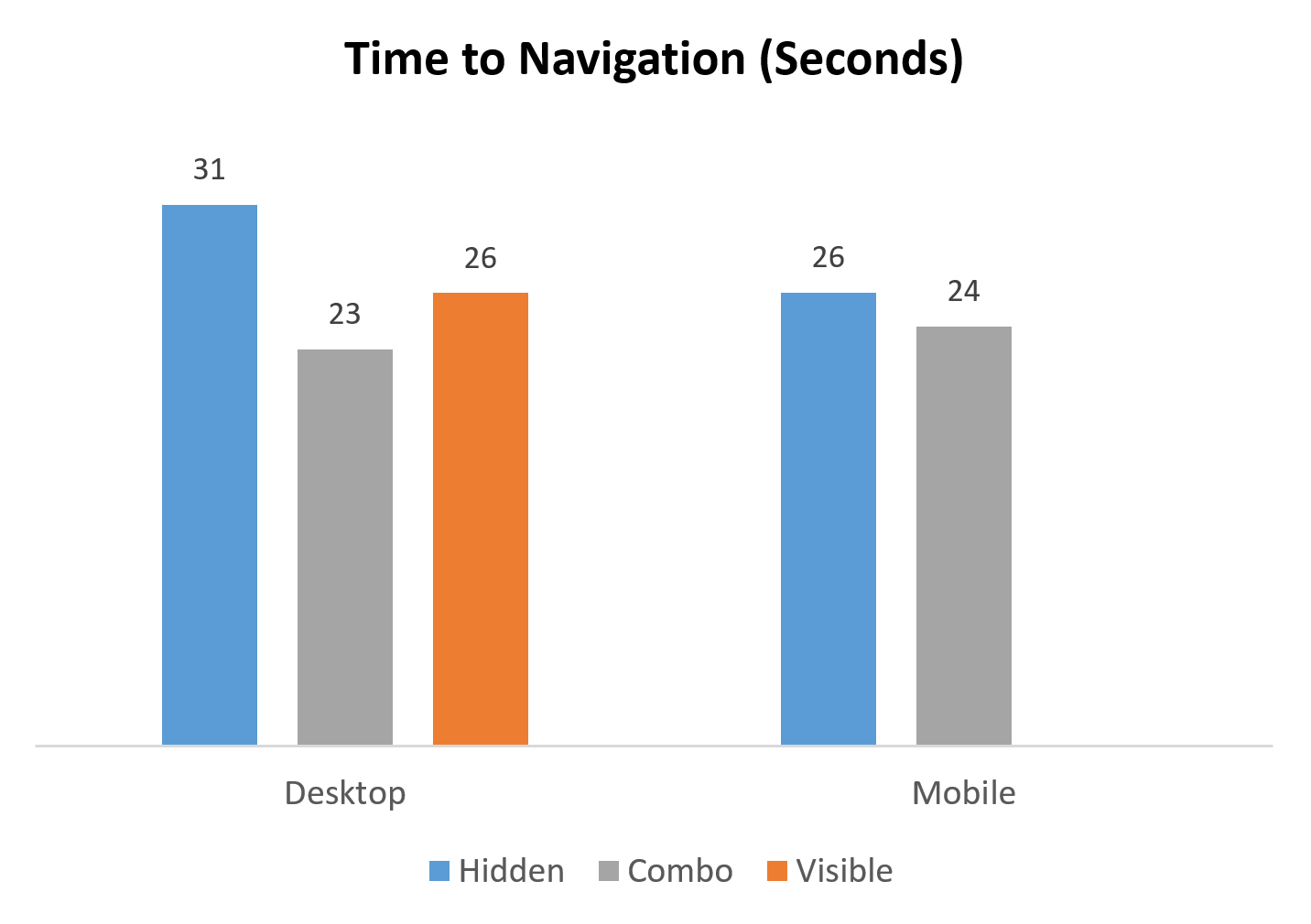
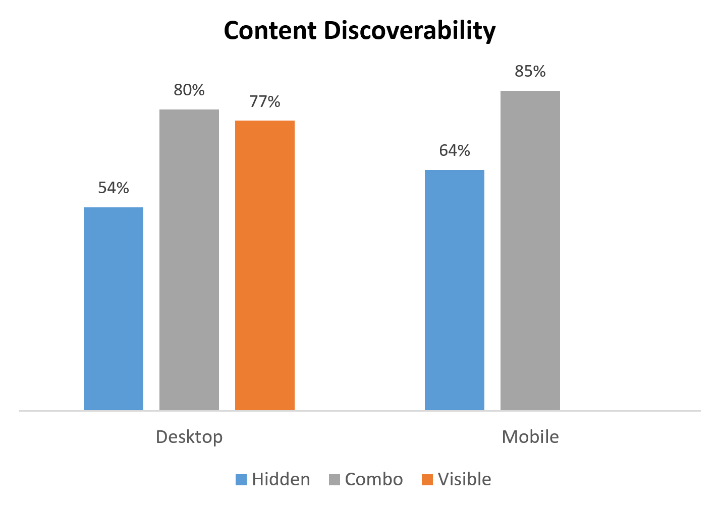
According to studies performed by the Nielsen Norman Group, hiding navigation significantly increases the time it takes for users to complete a task while decreasing navigation use and content discoverability. The group summarized its findings by saying, “Discoverability is cut almost in half by hiding a website’s main navigation. Also, task time is longer and perceived task difficulty increases.”
Doing it right
Nielsen's research indicated that in some cases, having both visible and hidden navigation can be as or slightly more effective than visible-only navigation. If your site is content-rich, consider showing the three or four most important links and hiding others behind a “more” menu.
5. Interstitials and loading screens
Interstitials are full-page ads that appear in between content pages. The user clicks on a link and instead of getting the desired page, gets an ad. Interstitials are extremely disruptive, and Google punishes sites that use interstitials on mobile pages.
Only slightly less disruptive are pop-ups, which take over a user's screen while he or she is trying to scan a page.
Loading screens simply prevent users from accessing content for some amount of time. Many loading screens are a cover for poor site performance and should be avoided if at all possible.
Why they should go
Interstitials, pop-ups and loading screens all take users away from page content. They interrupt people precisely as they are trying to accomplish a task, which can be very frustrating.
Doing it right
While there is no excuse for using interstitials or loading screens, pop-up ads can find a place on some web pages. Pop-ups are extremely popular because they are effective. Pop-ups drive sign ups, downloads and other conversions, even if users hate them.
If you are going to use a pop-up, you must offer visitors something relevant and of value. Users can forgive a pop-up if they think they have received something worthwhile for their trouble.
6. Bad typography
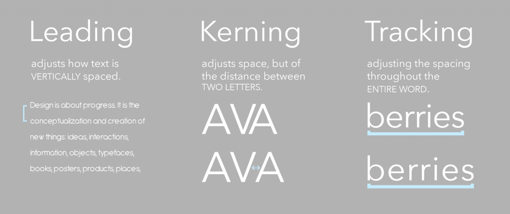
Three tiny typographic elements, unnoticeable when done right, can make or break a page layout. These are leading, tracking and kerning. Leading is the space between lines of text on the page. Tracking and kerning affect the space between characters.
Why it needs attention
The size of your fonts and the space between letters and lines of text dramatically affects readability. When text is too small or lines are too close together, it can be very difficult for readers’ eyes to adjust and (literally) see the words on your pages. Although visitors might not recognize this consciously, their eyes will become tired, making it more likely they will click away from your site.
Doing it right
Choose one or two dominant fonts and use only those throughout every page on your site. Choose fonts that were designed for web use as they will be more likely to have native tracking and kerning that are suitable for online reading.
Develop a system for the size of your headings and the spacing of your text and stick to those guidelines everywhere. A good rule of thumb is to keep line-height, or leading, to approximately 1.5 to 1.6 times the height of your base font’s characters. Adjust this number down for headings and larger fonts, so that lines of text will not look like they are floating away from each other.
Conclusion
While the practices discussed here should generally be avoided, remember there are no one-size-fits all guidelines for website design. Before implementing an established trend or a new technology, first consider the purpose of the site and the needs of its users, and try to understand how users will interact with it. Some trends may work well for one user group but hopelessly frustrate another.
The measure of a successful website, and ultimately a happy client, is whether people understand it and can use it to execute tasks website owners want visitors to complete.


