Color choices play an important role in establishing and supporting a brand's personality. Color can influence both buying decisions and general perceptions about a brand or product. But the relationship is not as straightforward as many marketers would have you believe. The way two different people with two different life experiences and personal preferences will perceive a color is unavoidably subjective.
To say that picking red as a primary color for your firm will make every potential client see you as powerful is too simplistic. Color psychology is a complex science, one that people may spend their whole lives studying.
While there are no absolutes, research has revealed some interesting behavior associations with color, like it's relationship with appetite or energy. Such information contributes to industrial design choices, making deep red dining room walls more common than bright blue ones and muted earth tones more popular for spas while bright primary colors adorn toy stores and playgrounds.
In each of these examples, the context of the color choice matters tremendously. Studies performed specifically on the appropriateness of color choices confirm that making the right connection between color and perceived brand personality can positively affect brand value. Picking blue because color theory suggest blue instills trust may be the right match if your firm is creating an identity based primarily in the traits of seriousness and authority. The key is anticipating how your audience will react to the match (or mismatch) between the colors you choose and the character you are building — the emotions and traits you want people to associate with your firm.
Learning from the big brands
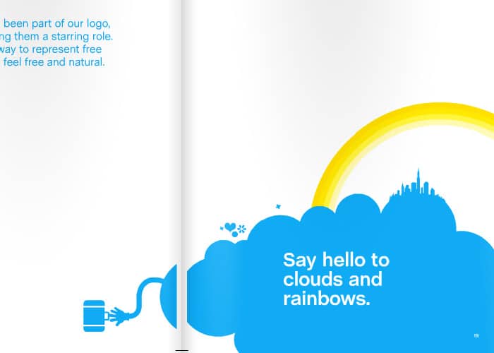
1. Skype.

In its brand book, Skype describes its personality as “bright, bold, colourful and confident.” Skype's primary brand color is, appropriately, a bright blue. The intensity of the color matches the company's stated traits. Had Skype chosen a deeper, darker blue, it would have created a disconnect between the personality it wants to convey and the color representing that personality. The blue in and of itself is not the most important brand element — the relationship between the blue and the brand's personality is what makes the color work.
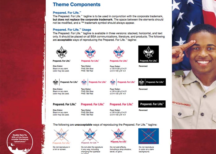
2. The Boy Scouts of America.

The Boy Scouts also use blue, but in a very different way. The organization states its brand position as single-minded and its personality as trustworthy, patriotic and faithful. The deep blue and brighter red of the logo match the colors of the American flag and establish a much more conservative, less playful feel. The “Scouting Red” and “Scouting Blue” are serious and rugged and are good choices because they support the existing, long-standing brand.
Context and competition
Context also matters with respect to competition. If all other firms in your market are branding themselves using blue, you will likely benefit from choosing green, red or yellow — anything that stands out. Memories are strongly associated with color. Making a choice to intentionally differentiate within a specific market can increase recognition and support your firm's overall brand.
Your firm can use color choices to evoke some probable reactions and associations when the colors are used within an overall marketing framework that makes sense. Here are some general color classifications that can be used to guide your decisions:
Warm colors: Reds, oranges and yellows
Warm colors are emotional powerhouses, bringing energy and power to a brand. However, like all colors, warm colors carry both positive and negative emotional associations.
Red evokes a spectrum of emotions from love to anger. Some words commonly associated with red are: stimulating, dominant, anxiety-inducing, strong, vital, aggressive and bold. Red has a physically stimulative affect in some people and has been shown to raise heart rate, blood pressure and perspiration rate.
Deep reds are correlated with power and prestige, but bright reds signal hazard or danger, vigor or health. In website design, red can be commanding as an accent color and can work to increase conversion when used pointedly on buttons as a contrast to another main color. Red can also be overwhelming if it comprises the bulk of a layout.
In practical terms, firms working in some areas like personal injury or bankruptcy should be cautious when building red into a brand personality. Clients who are experiencing physical, financial or emotional difficulties are already stressed. Too much red could create a dissonance that increases stress and tension.
As a symbol of power, red can work for some firms, like those focused on business or criminal law, because it conveys a sense of authority and strength. In these areas, the emotions associated with deeper reds can be reassuring, coordinating with a brand personality that is powerful and determined.
Orange is a color of energy and vitality, linked to many natural items like oranges or autumn leaves. Words commonly associated with orange are: warmth, energy, cheerfulness, sociability, novelty, comfort, desire and freshness. Orange has much of the vigor of red with slightly less emotional baggage. Brighter oranges can be used to convey imagination and spirit, while deeper oranges match a personality that is more measured and traditional.
Yellow is identified with creativity and sunshine but also with caution. Words commonly connected with yellow include: optimism, confidence, caution, self-esteem, innovation, friendliness, happiness, freshness, brightness and awareness.
In design, bright yellow can give clients the sense your firm is willing to innovate and implement new or different solutions. Lighter yellows convey a sense of comfort or ease while deep yellows and golds a exude a feeling of permanence and wealth.
Cool colors: Blues, greens and purples
Cool colors are just as powerful as their warm counterparts. Some secondary cool colors are made by combining a cool color with a warm color. Because of this, secondary colors can pick up some of the traits of the warm color contained with them.
Blues and purples carry many of the same meanings, but blue is by far more popular and one of the most commonly used colors in law firm branding. Words associated with blue include: intelligence, trust, serenity, dignity, duty, coolness, calmness, soothing, secure, comfort, thoughtfulness, sadness and tradition.
Blue is very versatile. Some perceive blue to be calming and soothing. Bright blues, however, are fresh and energetic and can add intensity to a firm's personality. Lighter blues can be peaceful and reassuring. Blue is also grounded, representing responsibility, stability and power. Since it is so widely used in corporate branding, blue also carries a sense of professionalism and experience.
Blue is preferred by both women and men despite cultural stereotypes. Purple comes in second among women, according to Joe Hallock's Color Assignments study, while purple is the second most disliked color among men, losing to brown by only five percentage points. Purple is the color of royalty and can be used to represent strength, power and wealth. Purple is also connected to spirituality, luxury, quality, mystery, leadership, glamour, thoughtfulness, exclusivity and stateliness. However, given these strong gender-based associations, you should understand the makeup of your audience first before using purple.
Green is, quite literally, down to earth. Words commonly associated with green include: harmony, peace, wealth, freshness, earthiness, fertility, serenity, balance, security, hope, nature, envy and greed.
Green is a natural color; it can represent growth as well as stability. Greens containing more yellow are stimulating while those containing more blue are cooler and more serene. Bright greens can be used to tell clients your firm is forward looking, energetic and willing to take a fresh approach to solving legal problems, whereas darker greens have a more stable, matter-of-fact personality.
No color is perfect for one practice or verboten for another. Sometimes it is best to use colors that are unexpected, drawing attention to your firm as unique and making a memorable impression. But the best way to break the rules is to understand them first. A potential client's reaction to color — and how that color coordinates with your firm's personality — must be taken into consideration when developing your design and marketing strategies.

