In February of 2015, Google made waves in the SEO community by announcing a major algorithm update before rolling it out. The change, which went into effect two months later in April, expanded Google's use of mobile-friendliness as a ranking signal. The ensuing rankings shake-up, hyperbolically dubbed “Mobilegeddon,” did push website owners to make significant changes. According to Smashing Magazine, eight months after the event, 25 percent of websites that were not previously mobile-friendly had made the switch, with most (85 percent) choosing a responsive layout.
The past year has proven that Google can use its weight to push for a desired outcome, in this case a more mobile-friendly web. Now, Google has decided to push a little harder.
On May 12, Google’s John Mueller, announced on Twitter that the latest round of mobile updates, which were briefly described on Google's Webmaster Central Blog in March, have finished rolling out. Google has not revealed many details, saying only that the change further strengthens the mobile-friendly ranking signal. In theory, this should give more of a boost to mobile-friendly pages within mobile results and cause more of a decline in rankings for non-mobile-friendly pages.
On its blog, Google claims that if your website is currently mobile-friendly, you should not need to worry. It also provides links to its Webmaster Mobile Guide and Mobile-Friendly Test tool, just in case you want to brush up on how to produce a good mobile experience. Given Google's focus on mobile, brushing up is a good idea.
Here is a review of the things Google is looking for in a mobile-friendly page. Even if your site is mobile-friendly (and it should be), it never hurts to review where your pages stand and see if there are any tweaks you can make to ensure your pages pass Google's increased scrutiny.
Technical specs
1. Include a viewport meta tag
According to Google, “Pages optimized for a variety of devices must include a meta viewport element...” Correctly defining the viewport is key to having a mobile-friendly page. This is something your developer, webmaster or IT team should have done for you. Here is how you can tell if they have.
The viewport is the amount of a page that appears on a screen at any given size. Your phone's viewport, which is usually between 320 and 400 pixels, is vastly different than a desktop's, which is most likely over 1000 pixels wide.
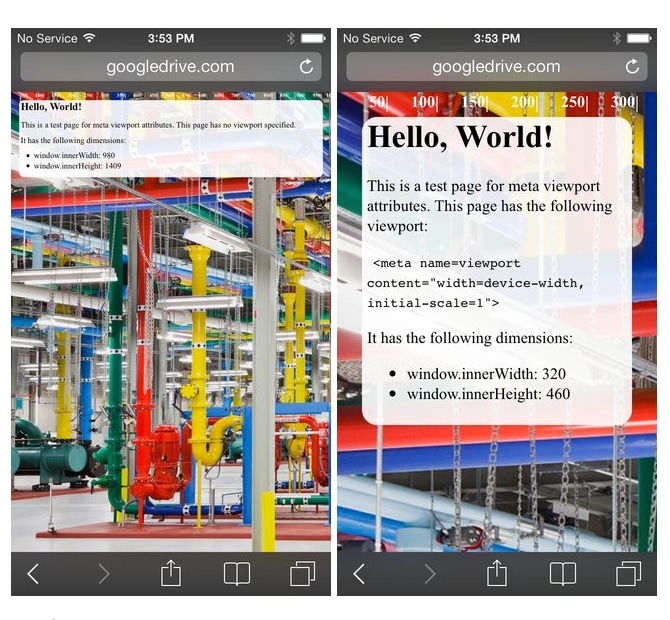
If a page does not contain a viewport element, the browser will display the desktop version of the page, regardless of the device. What you see on a phone will look like a very tiny desktop site, usually unreadable. Users will have to zoom to read text and find links. Here is an example of how a page looks, with and without the viewport tag.

Left: no viewport element. Right: with viewport tag.
If you are feeling adventurous, you can look at the code of your pages to see whether the viewport tag is included. When you are sitting on the page you would like to view, do one of the following:
-
- Chrome: Menu bar > View > Developer > View Source
- Explorer: Right-click the background or text of the page and click view source
- Firefox: Menu bar > Tools > Web Developer > Page Source
- Safari: Use the keyboard shortcut, Command+Option+U
The viewport meta tag looks like this:
<meta id="viewport" name="viewport" content="width=device-width, initial-scale=1">
It should be in the very top (or <head>) section of the document.
2. Remove Flash elements
Most mobile browsers cannot display Flash, and it therefore has no place on an attorney website. Flash is outdated; it will only slow your page load speed and help you to fail Google's mobile-friendly test. Advanced CSS and Javascript techniques can create any animation or slideshow you may need. Pages will be much lighter, faster, modern and more user-friendly without Flash.
3. Properly size images, video and content divs
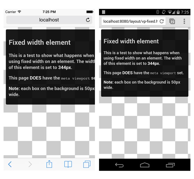
Page elements can be sized using absolute or relative pixel dimensions. The difficulty with using absolute pixel dimensions for large elements is that those elements will not resize on small screens, even if the viewport is configured correctly. For example, if you want an image to fill the whole width of a column, you could set the with as either, "width: 720px," or "width: 100%." The 720 pixel width may look great on a desktop, but it will be far too wide on a smartphone, and visitors will have to scroll horizontally to see the whole thing. The picture sized at 100 percent will adjust to display properly on both.
In the example below, the box on the left is set to a fixed width of 344 pixels, which is too wide for the screen. The box on the right is set relatively, at 100 percent, so the content displays at the correct width.

Again, this is something a developer should have incorporated into your site's code. If you have images running off the screen on smaller devices, your pages need updating.
Design specs
1. Set the font size and line-height at readable values
Your text must be large enough to be readable on all devices. Google suggests a base font size of 16 CSS pixels and a line-height of 1.2em. This means that your paragraph text will be set at 16 points (1em) and all other text, like headings or captions, will be sized relative to that base unit. The line-height is the space between the lines of copy, and it must be large enough for the text to read smoothly but not so large that the sentences float apart on the page.
2. Make links easily tappable
Tap targets, or links, must be large enough and spaced far enough apart that users can easily tap them without being frustrated or accidentally tapping on the wrong item. Again, Google gets down to nitty gritty pixels and recommends that all buttons and links be at least 48 CSS pixels tall/wide and at least 32 CSS pixels apart.

A page that is optimized for mobile conversion should already contain very few links. You want users to be able to find information and take action quickly, and cluttering the page with links is confusing and counter to a positive user experience. Also, remember that there is no mouse hover on mobile devices, so your mobile-optimized pages should not rely on hover effects to show users where links exist.
Content specs
1. Write for mobile
The key to writing mobile content is brevity. People scan pages rather than reading from top to bottom. According to research performed by the Nielsen Norman Group, people read only 20-28 percent of the words on a page. Google and the BBC recommend that you make your main point within the first four paragraphs, or 70 words.
Write in active voice, and use short sentences and short paragraphs. People prefer to read content written in clear, direct language, and the more complex the topic, the more clear and direct the writing should be.
2. Eliminate unnecessary content
Understanding user intent is critical to designing effective mobile pages. Just because you can use responsive design to neatly display every element on a page at any screen size does not mean you should.
Ask yourself: What is the visitor trying to accomplish on this page? Then ask: Does everything on the page help the visitor achieve his or her goals?
You will likely be able to remove most if not all images, animations and slideshows. Images make pages bulky and slower to load; they constitute 60 percent of all page weight. You can also pare down forms (one or two input lines only!) or eliminate them entirely.
If your firm has the resources, it should consider creating alternate versions of page copy that are written specifically for mobile users.
Google has confirmed time and time again that it will continue to push for a mobile-friendly web. Google Webmaster Trends Analyst Gary Illyes has already announced that the next mobile update will focus in part on page speed. The trend is impossible to ignore. Your firm's SEO efforts and your visitors will both benefit if you put care and attention into your mobile pages.

